Think of a figure legend as the narrator for your data. It doesn’t just label; it guides the reader through the story your figure is telling. And just like a good narrator, it needs to be concise, clear, and helpful without stealing the spotlight.
So how do you actually write one? That’s what we’re about to unpack.
What Is a Figure Legend?
Before we get into the mechanics, let’s be clear about definitions.
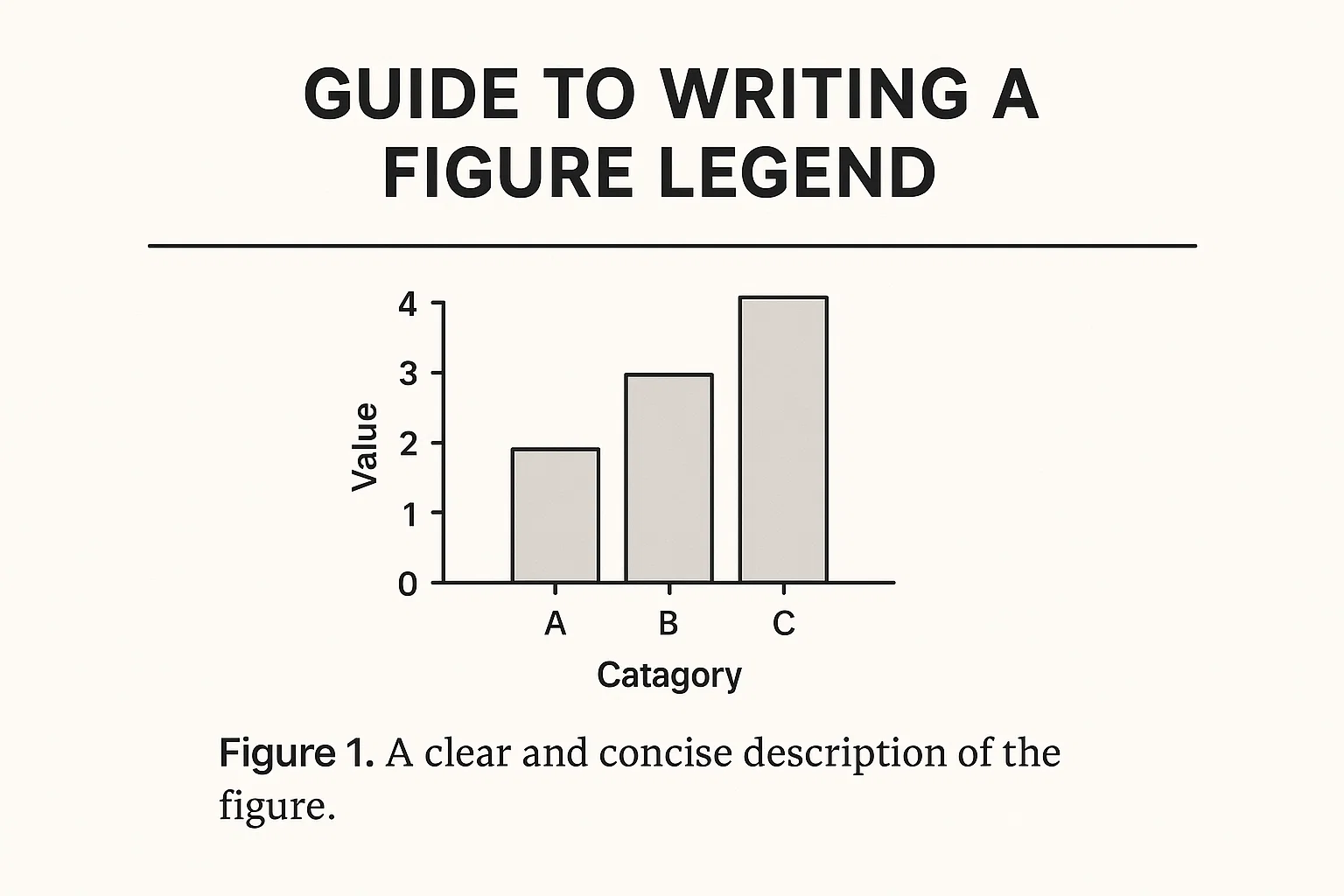
A figure legend is the explanatory text placed below a figure in a report, article, or paper. It explains what the figure shows, highlights key features, and provides context so the reader understands the data without hunting through paragraphs of main text.
A lot of people confuse a figure legend with a simple caption. But they’re not exactly the same:
Caption = The label (e.g., “Figure 2: Growth of bacteria at different pH levels”).
Legend = The detailed explanation of the figure, including notes on abbreviations, colours, and key takeaways.
In short: the caption tells you what the figure is. The legend tells you what it means.
Why Do Figure Legends Matter?
Imagine you’re scanning through a research article. You’re not reading word-for-word, you’re skimming figures and tables. That’s how most academics and professionals digest information quickly. If the figure legend is vague, you lose the thread.
Good legends:
Save readers time
Prevent misinterpretation
Strengthen the professionalism of your report
Help your work get cited (yes, really people trust clearer work)
Bad legends, on the other hand, leave readers frustrated and can make your data look less credible.
How to Format a Figure Legend
Formatting isn’t glamorous, but consistency is non-negotiable. Journals and universities have their own style guides, but here are the basics:
Placement: Always below the figure.
Numbering: Figures should be numbered consecutively (Figure 1, Figure 2, etc.).
Font: Use the same font style and size as your body text unless your guide says otherwise.
Length: Aim for 2–4 sentences. Long enough to be complete, short enough not to bore.
Clarity: Don’t repeat the exact same sentences from your results section. Summarise the essentials.
A neat, professional look tells reviewers you know what you’re doing.
How to Write a Figure Legend Step by Step
Here’s the meat of it, step-by-step instructions for nailing your figure legend.
1. Start with the Title
Open with a short, descriptive sentence. Don’t be vague. Instead of “Bacterial Growth,” write “Growth of E. coli at Different pH Levels Over 24 Hours.”
2. Describe What’s Shown
Briefly state what the figure displays. For example: “Bars represent the mean values of three independent experiments.”
3. Explain Symbols, Colours, or Abbreviations
Never assume your reader knows what “red” means in your chart or that “SEM” is obvious. Spell it out once: “Error bars indicate standard error of the mean (SEM).”
4. Mention Methods Briefly
If the figure uses a method that isn’t obvious, give one line: “Data were normalised to control group values.” Don’t copy-paste your full methods section.
5. Highlight the Key Takeaway
Close with the punchline. What does the reader need to notice? For example: “Results show significantly higher growth in acidic conditions compared with neutral pH.”
That’s it. Five steps, one solid legend.
How to Write a Figure Legend in a Lab Report
When you’re writing for a lab report (especially as a student), the expectations are slightly different from professional journal submissions.
Be more explanatory. Assume your reader is learning, not an expert.
Avoid jargon. Keep it simple unless you’ve defined the term earlier.
Don’t analyse too deeply. Save your interpretation for the discussion section.
Example (Bad):
“Figure 3 shows the graph of enzyme activity.”
Example (Good):
“Figure 3: Enzyme activity of catalase measured at varying temperatures. Bars represent mean values from three replicates. Error bars indicate standard deviation. Enzyme activity peaked at 37°C and declined at higher temperatures.”
Notice how the second version adds depth without crossing into full analysis.
Best Practices for Clear Figure Legends
Over the years, editors and peer reviewers have picked up on what separates good legends from poor ones. Here are golden rules:
Keep it short but complete. Two to four sentences is enough.
Avoid repetition. Don’t restate what’s already obvious from the axis labels.
Write for an outsider. Imagine the reader doesn’t have the figure in front of them. Could they still follow?
Stay consistent. If you use “SD” for standard deviation in one figure, don’t suddenly switch to “StDev” later.
Common Mistakes to Avoid
If you’ve ever seen a confusing legend, chances are the author tripped on one of these:
Repetition of data. If your Y-axis already says “Cell count,” don’t write it again in the legend.
Over-explaining. Readers don’t need a mini-results section in the legend.
Ignoring abbreviations. Never assume your abbreviation is universal. Spell it out once.
Leaving out context. A figure without a legend is basically decoration. Don’t let that happen.
Figure Legend Examples
Let’s make this practical.
Example 1: Biology Experiment
“Figure 1: Growth curve of E. coli in nutrient broth measured over 24 hours. Each point represents the mean of three independent cultures, with error bars showing standard deviation. The exponential phase began at 4 hours and peaked at 14 hours.”
Example 2: Data Chart
“Figure 2: Average smartphone screen time by age group in the UK, 2025. Bars represent mean hours per day (n=1200 participants). Error bars indicate standard error of the mean. Screen time was highest among 18–24-year-olds.”
Example 3: Flowchart
“Figure 3: Workflow for data collection in the survey study. Boxes indicate process steps; arrows show sequence. Survey distribution and analysis phases are highlighted in grey.”
These examples cover different disciplines, but notice how the format is consistent: clear title, brief description, explanation of symbols, and a key takeaway.
Final Tips for Polished Legends
Proofread every legend just like you would your abstract. Typos in legends stand out badly.
Match the tone of your document. A casual blog can get away with lighter phrasing, but a journal submission should be formal.
Get peer feedback. Ask someone unfamiliar with your data if they can follow the legend without reading the paper.
Wrapping Up
Figure legends are small but mighty. They can make your graphs sing or sink them into confusion. By keeping your legends concise, well-formatted, and clear, you boost the professionalism of your work and make life easier for your readers.
And here’s a bonus thought: clear writing often reflects clear thinking. If you can’t explain your figure in four sentences, maybe you don’t fully understand what it’s showing. That’s worth reflecting on.
If you’re still polishing your academic writing and need a quick boost, you can also try an AI Reword Tool on Spinbot to smooth out awkward sentences or make your language flow better. It’s a handy trick when you’re staring at your legends at midnight with tired eyes.

Oliver Bennett, with his Master’s degree from Manchester Metropolitan, is our in-house SEO specialist. At Spinbot UK Blog, he focuses on optimizing content to achieve the highest search engine rankings and edits articles to ensure they meet the highest standards of clarity and precision.