![]()
Why the Liverpool logo looks harder than it is
Football crests feel intimidating because they’re packed with meaning. Banners, symbols, numbers, curves that don’t forgive shaky lines. The Liverpool badge adds another layer because people recognise it instantly. One wrong proportion and it looks off. Here’s the truth: once you break it into simple shapes, it becomes a calm, logical drawing. That’s what matters.
Quick answer you can use right away
If you want to know how to draw Liverpool logo, start with a shield outline, sketch the Liver bird using simple curves, place the banner and flames, then clean the lines and add colour. Keep everything symmetrical and build it in layers instead of rushing details.
What is the official Liverpool logo?
The current crest belongs to Liverpool FC and features a shield shape, the Liver bird in the centre, two eternal flames, and the words You’ll Never Walk Alone at the top. It’s been refined over the years, but the core identity stays the same.
This matters for drawing because you’re not copying random artwork. You’re recreating a structured design with fixed proportions. Treat it like a blueprint, not freehand art.
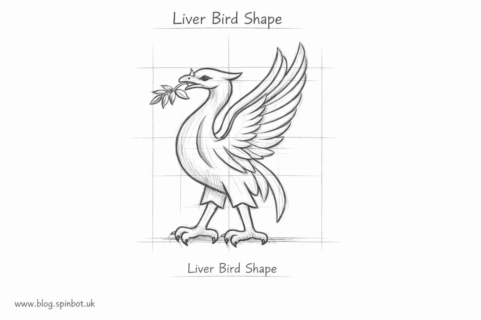
What does the Liverpool bird represent?
The Liver bird isn’t a dragon, eagle, or phoenix. It’s a mythical bird linked to the city of Liverpool itself. In the crest, it stands tall, wings slightly open, holding a branch. When drawing it, don’t over-detail feathers. The official design uses smooth, confident curves. Less realism, more symbolism.
What did Liverpool’s old logo look like?
Older versions were more decorative. Thicker lines, different shield shapes, and heavier text. If you’re curious, those versions are great practice sketches, but beginners should always start with the modern crest. It’s cleaner and easier to balance on paper.
What does the number 97 mean on the logo?
The number 97 honours the victims of the Hillsborough disaster. In the full crest, it appears between the eternal flames. When practising, sketch the flames first and add the number lightly later. Precision matters here. Keep it respectful and accurate.
Is Liverpool’s logo a dragon?
No. This question comes up a lot because of the flame shapes and bold silhouette. The centre figure is the Liver bird. If your drawing starts looking dragon-like, your wing curves are too sharp. Smooth them out.
How to draw the Liverpool logo step by step
Step one: draw the shield
Start with a vertical centre line. Sketch a wide U-shape for the bottom of the shield, then add straight sides and a curved top. Don’t press hard. This is your framework. Everything else depends on this symmetry.
Step two: place the Liver bird
Inside the shield, draw a light oval for the bird’s body. Add a small circle for the head. Sketch the wings as curved leaf shapes. Keep them balanced. The beak should point slightly upward, confident but simple.
Step three: add the branch
The bird holds a branch in its beak. Draw it as a thin curved line with a few leaves. Avoid realism. The official style is clean and graphic.
Step four: sketch the banner
At the top of the shield, add a narrow curved banner. Write You’ll Never Walk Alone in block capitals. Don’t crowd the letters. Spacing matters more than fancy typography.
Step five: draw the flames
On both sides of the shield, sketch flame shapes. Think of soft waves, not sharp fire. Keep both sides symmetrical. This is where many drawings go wrong.
Step six: refine the lines
Once everything feels balanced, go over your final lines with a darker pencil or pen. Erase the guidelines slowly. If something feels off, it probably is. Fix it now.
![]()
Why do Liverpool wear red and how it affects your drawing
Red is identity. When colouring, use a deep, slightly darker red rather than bright scarlet. Outlines should stay clean so the red doesn’t overpower the bird or text. If you’re shading, keep it subtle. Flat colour looks closer to the official crest.
Are Liverpool with Nike?
Yes. Nike is the current kit supplier. This doesn’t change the logo design, but it matters if you’re referencing shirts or badges from different seasons. Always draw the crest itself, not sponsor variations.
Can I use the Liverpool crest legally?
For personal learning, sketching, or fan art, yes. For commercial use, printing, or selling designs, no. If you’re practising digitally, tools like Spinbot can help rewrite captions or tutorials, but the artwork itself must stay personal. One internal mention is enough.
How to spot and fix common drawing mistakes
Most beginner errors come from rushing.
- Shield too narrow → widen it slightly
- Bird looks angry → soften the beak angle
- Flames uneven → redraw one side to match the other
- Text cramped → increase banner width
Fix structure before details. Always.
Why “You’ll Never Walk Alone” matters visually
It’s not decoration. It’s part of the club’s soul. That’s why it sits at the top, above everything else. In your drawing, keep it clear and readable. If the text feels squeezed, your banner is too small.
Should you practise other drawings first?
If you’re brand new to drawing, warm up with simpler shapes. Even something playful like how to draw a pizza helps control curves. But don’t over-delay. The Liverpool logo itself is a solid learning piece once you respect the steps.
How to know when your drawing is finished
Stop when it looks clean, balanced, and confident. Not when every feather is perfect. Logos aren’t realism tests. They’re clarity tests.
If you can look at your sketch from a distance and recognise it instantly, you’ve done it right.
FAQs
What is the official Liverpool logo?
The official logo of Liverpool FC is a shield-shaped crest featuring the Liver bird in the centre, the club motto You’ll Never Walk Alone at the top, and two eternal flames on each side.
Is the Liverpool logo a dragon?
No. The figure in the centre is the Liver bird, a symbol of the city of Liverpool. It’s often mistaken for a dragon because of its bold shape, but it’s a bird with smooth wings and a branch in its beak.
What does the number 97 mean in the Liverpool logo?
The number 97 represents the victims of the Hillsborough disaster. It appears between the eternal flames in the full crest as a mark of remembrance and respect.
What did Liverpool’s old logo look like?
Older Liverpool logos were more detailed and decorative, with different shield shapes and heavier lines. The modern version is cleaner and easier to recognise, which also makes it easier to draw.
Can I use the Liverpool crest in my drawings?
You can draw the Liverpool logo for personal practice, learning, or fan art. Using it for commercial purposes, selling designs, or branding requires official permission from the club.
What is the Liverpool bird called?
It’s called the Liver bird. It’s a mythical bird linked closely to the city of Liverpool and has been part of the club’s identity for over a century.
Why do Liverpool wear red?
Liverpool wear red because it became the club’s defining colour in the 1960s, symbolising strength and unity. When drawing the logo, a deep red works better than a bright one.
Are Liverpool with Nike?
Yes, Nike is Liverpool’s current kit supplier. This affects shirts and kits, but the core logo design stays the same.
How can you spot a fake Liverpool shirt?
Fake shirts often have poorly stitched crests, uneven flames, incorrect font spacing, or a distorted Liver bird. A clean, symmetrical logo is a key sign of authenticity.
Do Liverpool lose their logo details when resized?
No. The official logo is designed to stay clear at different sizes. If your drawing loses detail when scaled down, the lines may be too thin or uneven.
How long does it take to learn how to draw the Liverpool logo?
Most beginners can sketch a recognisable version in 30–60 minutes. With practice, the shapes and proportions become much easier to reproduce accurately.
Is the phrase “You’ll Never Walk Alone” just decoration?
No. It’s central to Liverpool’s identity. In the logo, it sits above everything else to show its importance to the club and its supporters

Rachel combines her technical expertise with a flair for clear, accessible writing. A graduate of the University of Edinburgh, she specializes in creating detailed tech-focused content, Govt Jobs, Payslips that educates our readers about the latest in web development and SEO tools at Spinbot blog.